In the digital marketplace, your website is your 24/7 storefront. But if visitors land on your page and leave without taking action, your design might be costing you money.
Driving traffic to your website is only half the battle; the real success lies in conversion. By implementing a few strategic UI/UX (User Interface/User Experience) tweaks, you can transform a passive browser into a paying customer.
Here are 5 proven design secrets to boost your website’s conversion rate today.
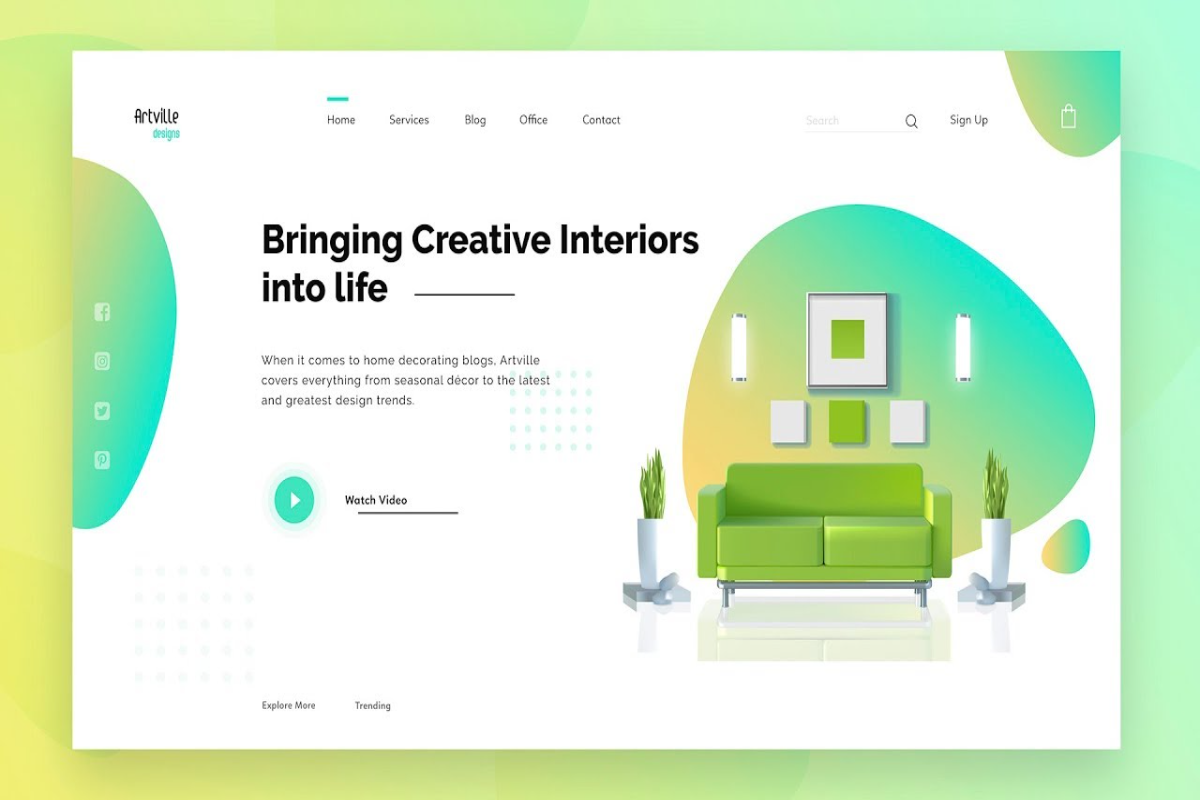
1. Master the "Above-the-Fold" Real Estate
When a user lands on your site, you have less than five seconds to capture their attention. The area they see before scrolling—known as "above the fold"—must clearly answer three questions:
- What do you offer?
- How does it solve the user's problem?
- What should the user do next?
Keep this section clean, use a bold headline, and place your primary Call-to-Action (CTA) button clearly in sight.
2. Simplify Your Navigation
If users have to hunt for information, they will leave. A confusing menu creates cognitive friction. Group your pages logically, use standard naming conventions (like "Services" instead of "What We Do"), and limit your main menu to five or six essential items. A seamless journey directly correlates with higher sales.
3. Leverage the Power of Visual Hierarchy
Naturally, the human eye reads web pages in specific patterns (usually an F-shape or a Z-shape). Place your most critical information, such as social proof, key benefits, and CTA buttons, along these natural reading paths. Use size, contrasting colors, and strategic whitespace to guide the visitor's eyes toward taking action.
4. Optimize for the Thumb (Mobile First)
Over half of all web traffic comes from mobile devices. A website that looks great on a desktop but breaks on a smartphone is a massive revenue leak. Ensure your buttons are large enough to be easily tapped with a thumb, text is readable without zooming, and images scale down perfectly.
5. Strip Away Forms to the Bare Essentials
Long, complicated contact or checkout forms are absolute conversion killers. Every additional field you add reduces the likelihood of a user completing the form. Ask only for what you absolutely need—typically just a name and an email address. You can always collect more details later.
Great web design isn't just about looking pretty; it’s about guiding user behavior. By prioritizing clarity, speed, and simplicity, your website will naturally shift from a basic digital brochure into a powerful lead-generation machine.
Ready to audit your site? Look at your homepage today and see if your primary CTA stands out immediately. If it doesn't, that is your first step to a higher conversion rate.